George Lois
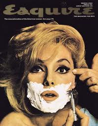
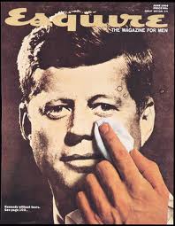
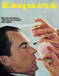
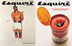
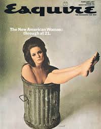
I like George Lois' work because i find the pictures to be kind of odd but interesting. In the first 3 images I have, it's as if the image of a man and a woman are reversed, where girls usually get their makeup done and the men would shave, but it's the other way around. The bottom images have more of a political meaning and are expressing society through photos.
Overall, i enjoy George Lois' work because it's very unique and I haven't seen anything like it before. The pictures are also very old fashioned looking and I love that! The concepts are very creative and i like how he tied a message to each picture.
Overall, i enjoy George Lois' work because it's very unique and I haven't seen anything like it before. The pictures are also very old fashioned looking and I love that! The concepts are very creative and i like how he tied a message to each picture.
Paula Scher
Paula Scher is a designer associated with the New York Retro Movement. Along with Louise Fili and Carin Goldberg, the three artists established a movement that rediscovered earlier 20th century graphics. Paula Scher's education is rooted in the Swiss International Style of typography. Her ideas were stronger than her drawing skills, and at the advice of her teacher, Stanislav Zagorski, began to illustrate with type. Ms. Scher has a contradictory approach to design. Her approach to design and type, and unorthodox attitudes regarding the, "rules" made her a leader in the field. She mixes fonts and colors, as well as extreme letter spaceing in her designs, but there is an underlying level of visual organization. In 1984 Paula Scher formed a partnership with Terry Koppel.
Scher has a profound respect for early twentieth-century design, which is clearly seen in her work. She pays homage to the movements and artists, sometimes as a compilation and other times singularly. She incorporates humor in her art, and in the case of the Swatch poster, employs a visual/verbal pun based on the Herbert Matter poster, not copying it.
Scher has a profound respect for early twentieth-century design, which is clearly seen in her work. She pays homage to the movements and artists, sometimes as a compilation and other times singularly. She incorporates humor in her art, and in the case of the Swatch poster, employs a visual/verbal pun based on the Herbert Matter poster, not copying it.
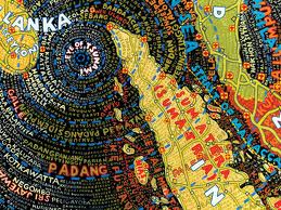
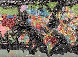
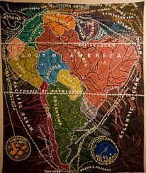
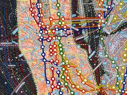
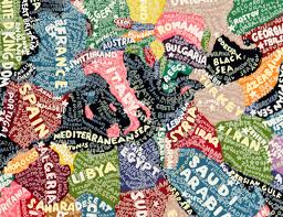
I like Paula Scher's work because it is so detailed and colourful. You can tell how much work she put into each map just by glancing at each piece of her work. The first picture I have here is probably my favourite because it's like an optical illusion where the words spiral out from the middle.
Overall, i enjoy Paula Scher's because the page is completely filled and appealing to the eye, and just a cool design concept. I can't imagine how much time must go into each piece but the end result makes it worth it all, in my opinion.
Overall, i enjoy Paula Scher's because the page is completely filled and appealing to the eye, and just a cool design concept. I can't imagine how much time must go into each piece but the end result makes it worth it all, in my opinion.
Woody Pirtle
Woody Pirtle is an artist commissioned in 2002 by Amnesty International to design a series of posters focusing on twelve of the individual articles of the Universal Declaration of Human Rights. Currently, he heads Pirtle Design, a design consultancy based in New York.
Woody Pirtle established Pirtle Design in Dallas, Texas in 1978. Over the next 10 years, the firm created identity programs and marketing materials for Baylor University Medical Center, The Dallas Museum of Art, T.G.I. Friday's, Dallas Opera, Diamond Shamrock Corporation, National Gypsum, Centex Homes, Gerald D. Hines Interests, Simpson Paper Company and NCR, to name a few.
In 1988, Woody merged Pirtle Design with Pentagram, an international design consultancy founded in London in 1972, becoming a partner at their New York offices for the next 18 years while continuing to work with some of the firm's most prestigious clients. Between 1988 and 2005, Woody and the office of Pentagram produced work for Brown-Forman, Bacardi Global Brands, Flying Fish Brewing Company, Watch City Brewing Company, Murray’s Cheese, Really Cool Foods, IBM, Champion International Corporation, Fine Line Features, The Rockefeller Foundation, Nine West, Northern Telecom, Knoll International, Wellesley College, Princeton University, Brooklyn Law School, and Amnesty International, plus many others. In 2005 Woody left Pentagram to re-establish Pirtle Design. In October 2003, he was awarded the prestigious AIGA Medal for his career contribution to the design profession.


I like Woody Pirtle's work because of the underlying message and/or creativity of each picture. I like how he ties together world problems and coordinates them with the picture, such as the children at war and the gun trafficking designs. The hair comb is also such a creative design, I liked it the second i saw it!
Overall, i enjoy Woody Pirtle's designs because of the messages he associates in his work, and he does it in a appealing and interesting way. The concept of each piece is so creative and expressed in a way that catches your attention right away.
Overall, i enjoy Woody Pirtle's designs because of the messages he associates in his work, and he does it in a appealing and interesting way. The concept of each piece is so creative and expressed in a way that catches your attention right away.
